
Carbic
The Next Era of Oilfield Management
Carbic was a frontier technology startup focused on streamlining and improving oil field management through a suite of intelligent sensors. The ask was to create a complete brand system and Website.




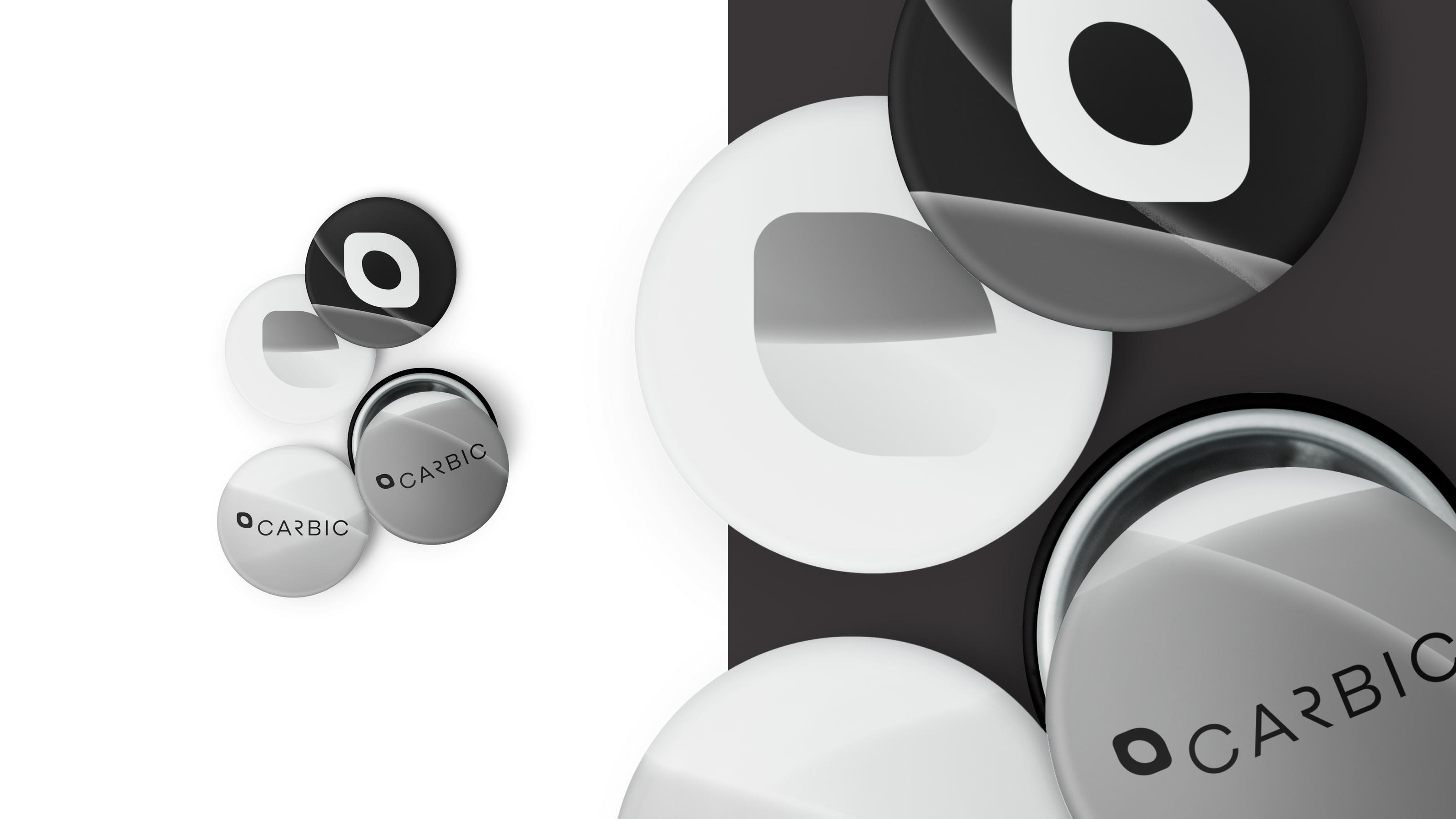
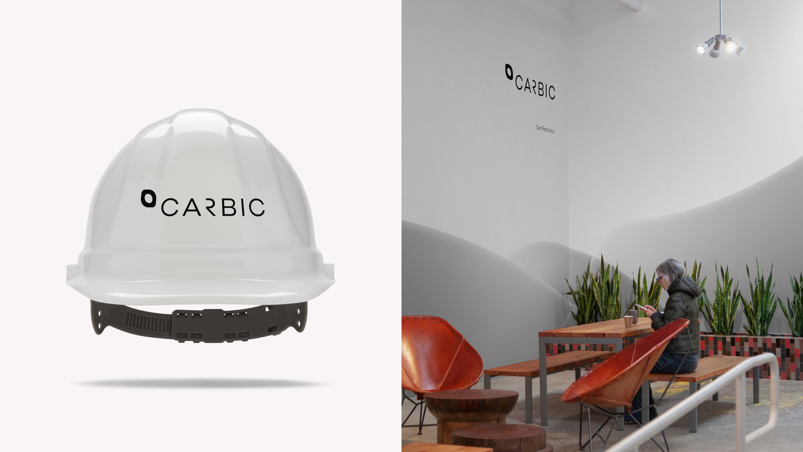
The logo is forward-thinking and modern. It is not shy about its visual treament. The organic droplet icon balances with the strong and rigid letterforms. The logo conveys the idea of the future through contemporary treatment and form. The logo is set in a modified version of Galano Grotesque, a typeface with roots in Midcentury modernism: the era where science and measurment would help improve humankind. The letterforms have been cut to bring to mind the curves and complexities of a pipe network but without sacrificing legibility.
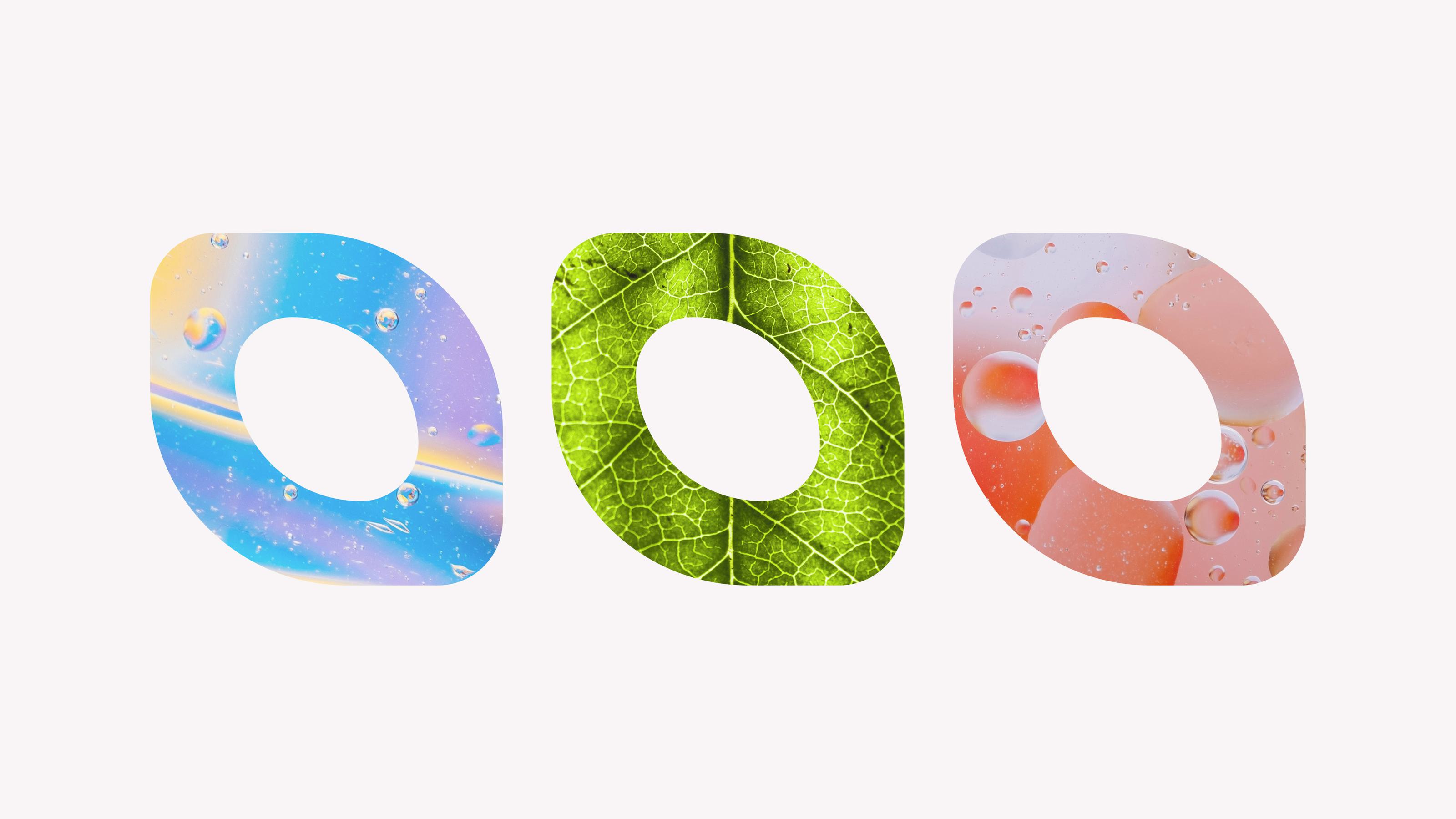
The droplet accompanies the logo and is the graphic for the logo. It combines three ideas: the product, the industry, and the potential. The ring-shape are the pipes measured by the product; the droplet shape is the liquid material flowing through past the sensors; and the leaf shape is the potential of energy and the ability for it to help grow and energize. It can move from large to small so that it can function strongly within the wide landscape of social media and online avatars — from favicons to app icons. The droplet can extend itself into brand touchpoints by acting as a container or frame for content related to a particular message.


The website contains calls to action and acts as a landing page for the launch of the product. It carries the branding throughout as well an introducing new styles of icons and background “slick” treatments.


