Gastrobot
Cuisine for the Curious

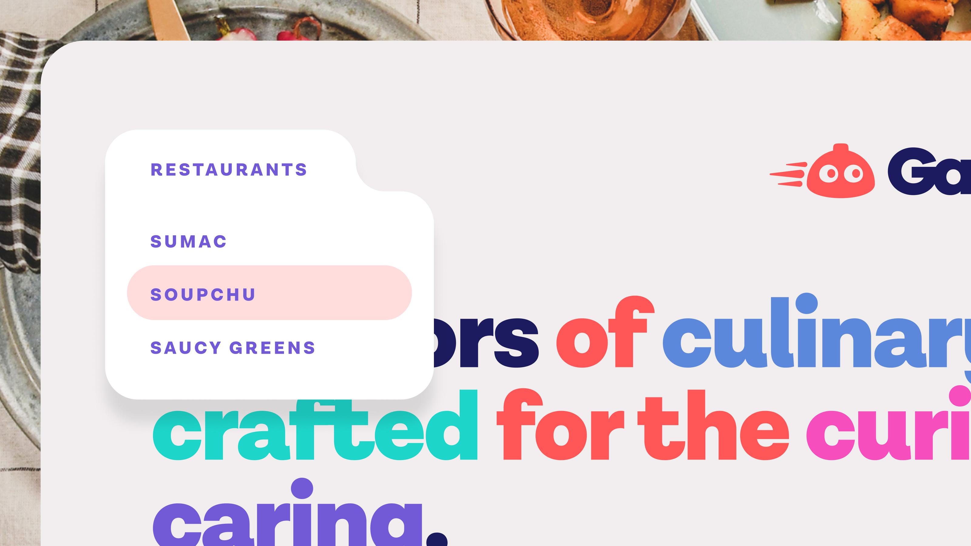
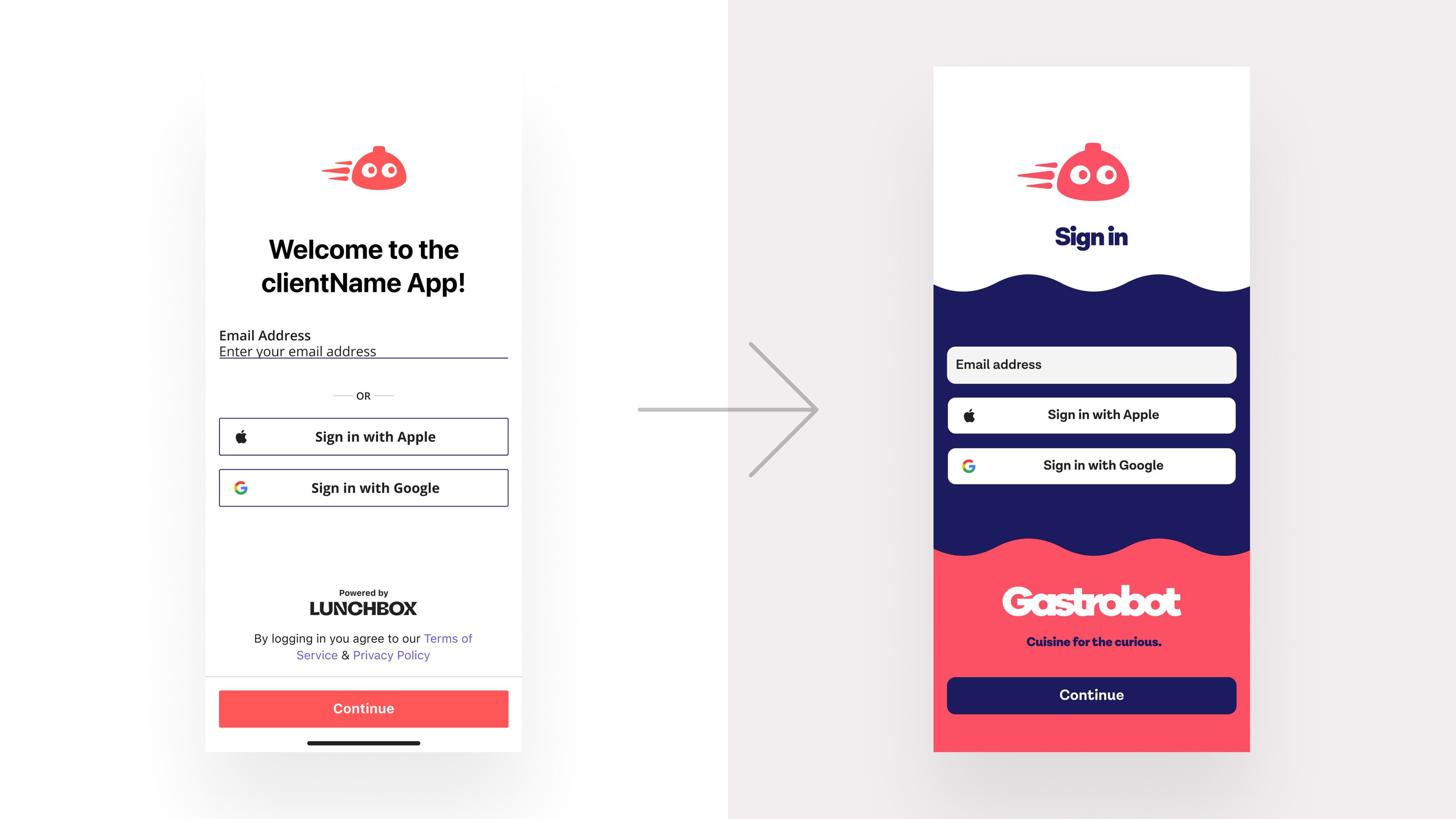
Gastrobot approached me with a problem: take their bland, templated design and transform it into a springboard for a suite of food destinations in California. Each one would have its own personality, but would live under the Gastrobot brand. Their existing UX and branding was uninspiring and sterile. With my help, we settled on bold colors, whimsical copy, and cute typography.
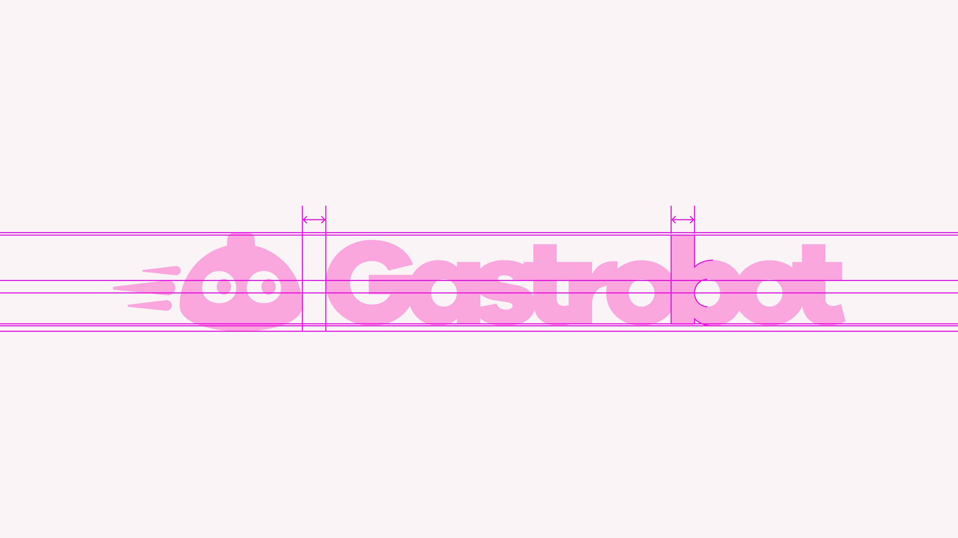


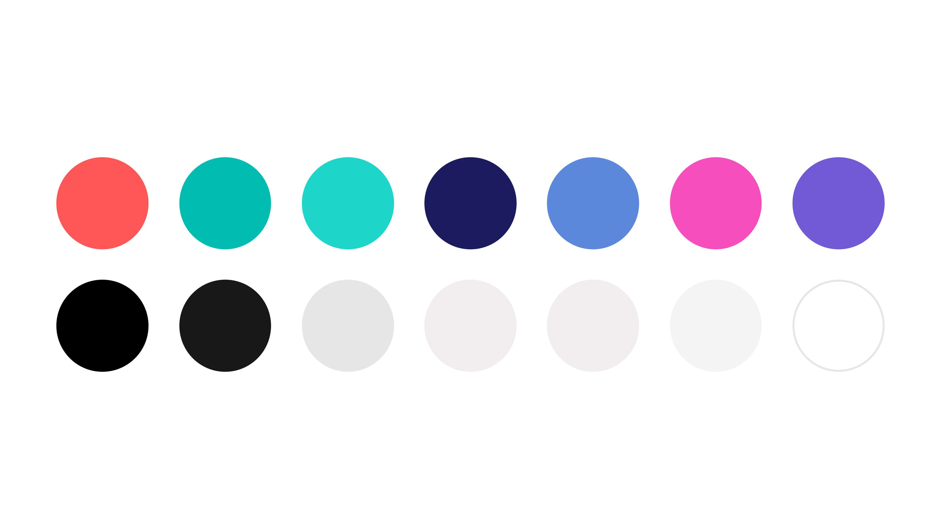
The new branding introduced bold colors and strong typography. Likewise, the Website and app UX embraced playfulness and simplicity. I gave special care to the user interface for mobile ordering so that checkout flows were easy to use, and the affordances were clear.
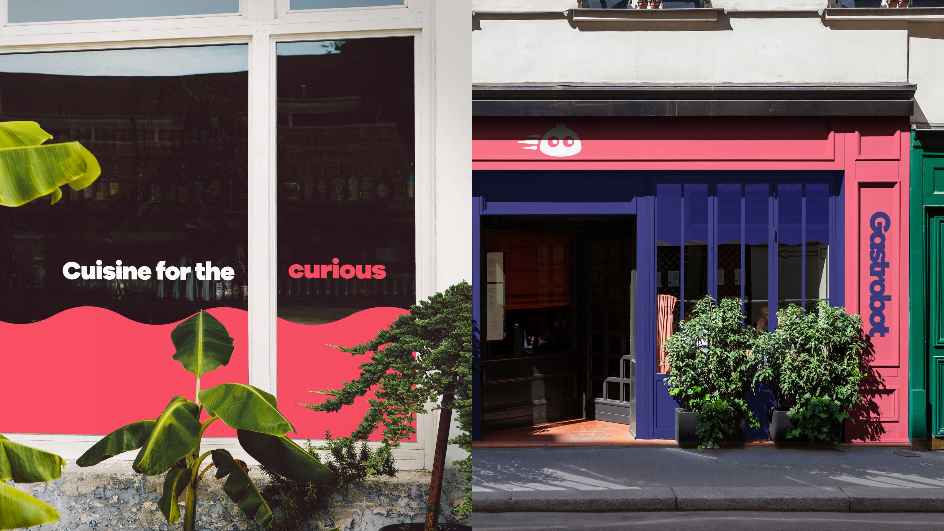
Various renderings were created of store concepts and designs for locations in San Francisco and Los Angeles.